Type Design @HAW Hamburg
Behind the cube
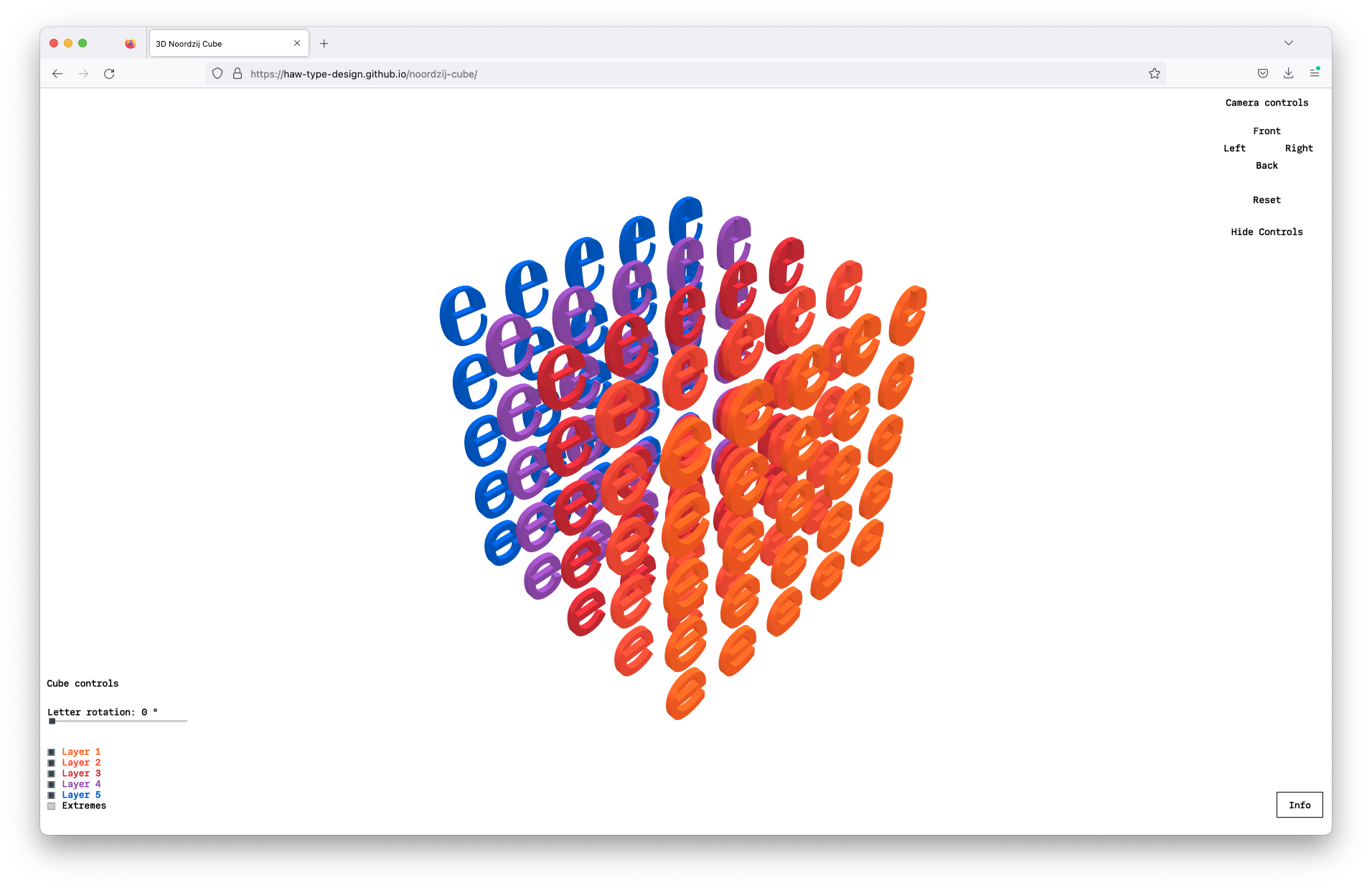
Much has been said about the Noordzij cube. Yet, often you only see its front and lefthand outermost layers. This representation can be quite difficult to wrap your head around, when you first encounter the Noordzij cube. In fact, only 61 e’s are visible in its standard representation when it has 125 e’s in total. Which is quite a challenge, when explaining the cube to students. So this is the endeavour to build it in 3D. To find a way to show the other 64 e’s. To use it in the browser. As I mentioned, there are many folks around that will be able to tell you much more about this artifact than I can do. For example here, here or here.
So this short text will take you into the making of this online cube and hopefully inspire you to play around with it — but not only the cube, but also the tools used to produce it.
I will take you into the workshop of making this. From drawing the font to putting it online. So let’s get started:
Drawing a font (+ deviation into higher order interpolation)

Drawing the font was pretty straight forward. I examined some source Material — some Noordzij drawings, some covers of »The Stroke«, some graphics he produced for his writings etc. — and drew the extremes. Yet, when interpolating these extremes, the tail of the e closes quite unpleasently.
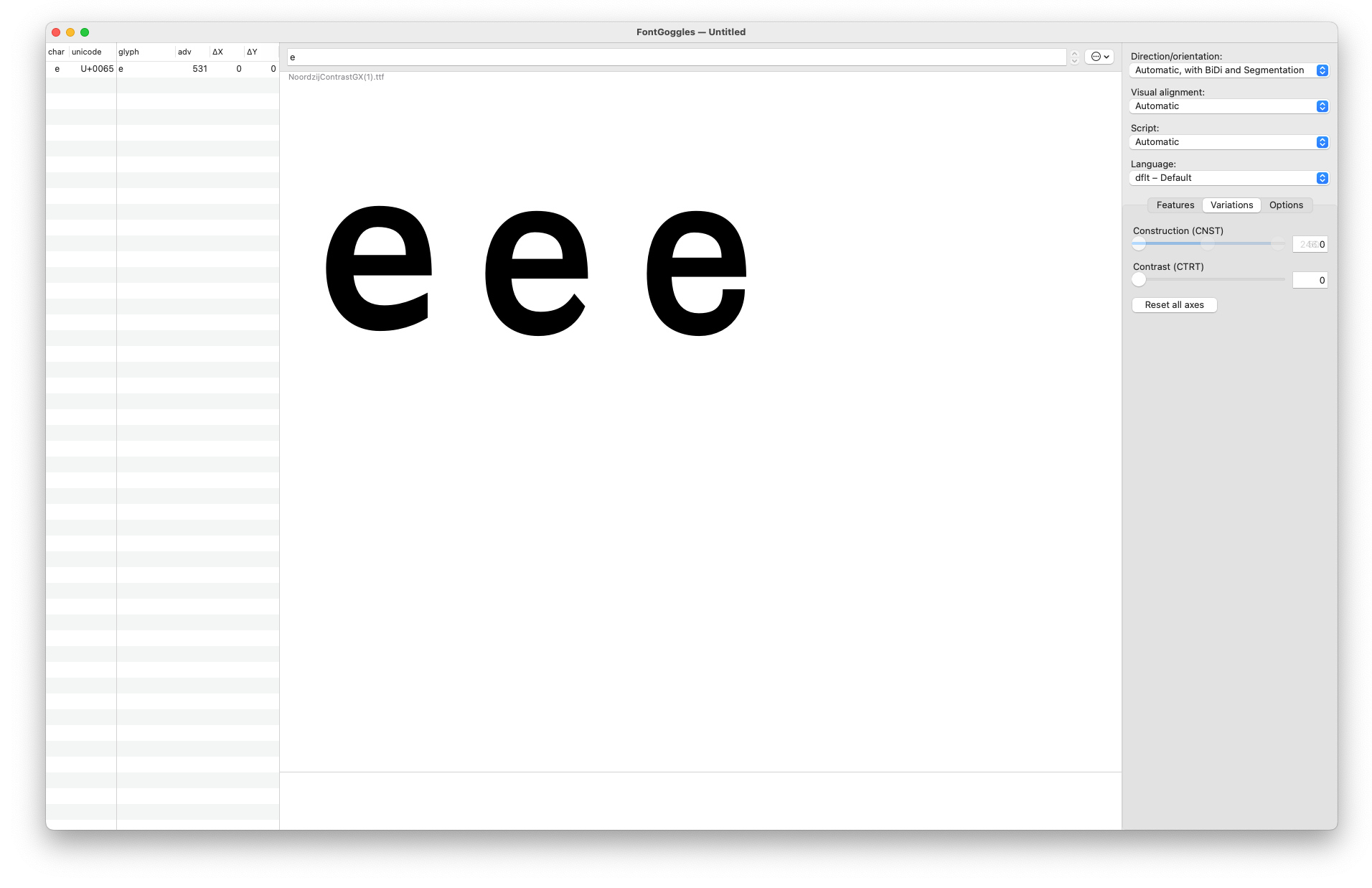
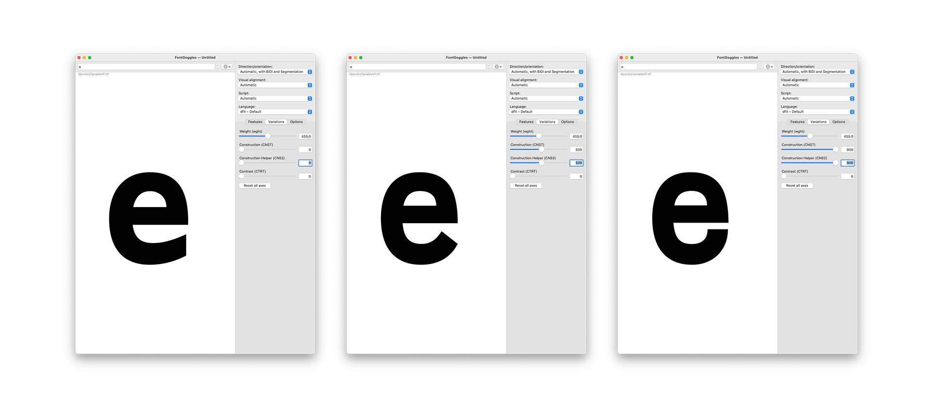
Enter: higher order interpolation or HOI in short. What this allows me to do: tame the tail of the e by defining not only its anchor points but also their movement. This also comes with a little tradeoff of having to introduce two new axes which help me to control the swing of the e’s tail. The glyphs files are available here for you to take a look, if you are interested in the concept.
If you want to learn more about the concept of higher order interpolation visit Underware’s case study or also Stephen Nixon’s Higher Order Interpolation experiments.
Setting up the cube in Blender (+ ST2)
Using variable fonts in 3D software can be tedious. Luckily, there’s a little Blender plugin which comes to our help ST2 (formerly Coldtype) by Rob Stenson. This Plugin made using the font in Blender smooth and easy. The cube was quickly constructed and all I had to do was to iterate through my axes and set every e to its position both in 3D space and in its design space — albeit here both are the same… The Blender files can be found in this repository as well. Feel free to play around with them.
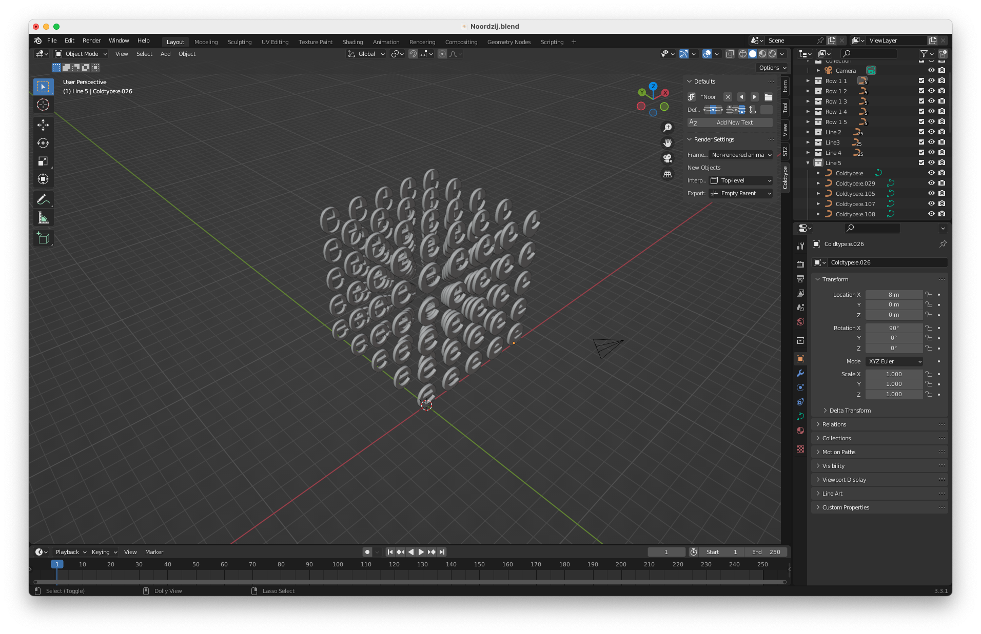
The last thing to conclude this step was preparing the 3D file to work on the web. All I had to do was to export the cube as glTF to prepare it to work in the browser.
Preparing the web framework (+ Babylon JS)
Working with 3D files on the web has become increasingly less barrier burden in recent years. For the Noordzij cube I made use of of the Babylon.js framework to take care of the rendering of the 3D files. This process was pretty much plug and play: Taking the 3D file and plugging it into the framework to distribute it via the browser.
Some UI to control both camera angles and the cube was added as well. This step seemed necessary to make full use of the cube: to rotate the e’s so that you could see them always facing you and explore both the changes in weight and contrast in the cube in its 3D space. Toggling layers seemed to make sense as well to better orientate yourself and be able to see only the necessary layers. But go and have a look at the 3D cube!
What’s next? (+ How you can play with this)
Personally, this web version is already helping us at HAW to better teach the Noordzij cube to students and help them understand the idea of a design space (most literally). However, we are very much interested what this will lead to: what happens if you plug in your own font? Play around with the files? We’re curious about your feedback so please hit us up to let us know what you think!
The repository for the cube can be found here please mess around with it and share your results!
About
The Virtual Noordzij Cube is an educational type design project developed and published by Prof. Pierre Pané-Farré and Simon Thiefes at the design department of the Hochschule für Angewandte Wissenschaften Hamburg. Simon Thiefes took responsibility for the coding. If you find bugs, please report them via GitHub, so we can fix them.